Tuesday 12 February 2019

Reveal: case study blog task

General

Look through the slides from the lesson on Reveal and use this information and your own research and analytical skills to answer the questions below. 


1) Based on your research, what type of people read Reveal? Consider demographics and psychographics.
The type of people that would read the magazine 'Reveal' would be either 'Strugglers' and 'Mainstreamers'.The demographics for this magazine is women aged 18-35 years old.Also women who are either in the lower class or middle class.


2) Look at the lesson slides: how does the editor introduce Reveal magazine?The editor introduces Reveal magazine as a magazine that delivers you 'fun,gossipy and full of advice' which reinforces the magazines identity as your 'best friend'.The editor from Hearst magazine also states that the magazine includes a strong focus on intimate aspects of some celebrities.


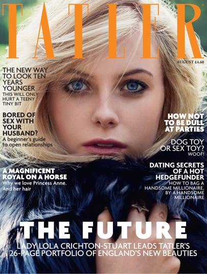
3) What is the difference between the Reveal and Tatler target audiences?The difference is mostly adult women,aged 18-34 unlike Tatler,which is London and south london centric,Reveal is bought by women all over the country.

4) What issues are Reveal readers interested in?
-Diet
-Motherhood
-Beauty 
-Social issues


Media language


1) How many of the 12 magazine cover key conventions feature on this edition of Reveal?Reveal uses some of the 12 key conventions such as:

  • title of publication which is used in the top third of the magazine.
  • slogans placed around it to show the audience some of the topics the magazine focuses on.
  • Bar code,Date and Price shown in the top left of the magazine which appeals to the audience for it shows that the magazine is affordable.
  • Language such as abbreviation 'carbs' and also alliteration used 'blooming baby bumps'.
  • Flash line used in the middle of the magazine backed up by a image relating to it which can potentially anchor the audience to buy the magazine.


2) What is the font choice used on the cover and what does this choice connote? 
The font used for the cover is sans serif which connotes informality,modernity and inexpensiveness.

3) How do the cover lines appeal to the Reveal target audience?
The cover lines appeal to the Reveal target audience because of how simple and easy they are to interpret regardless of their social class.Additionally the median of Reveals target audience are women aged 28 years old and by the magazine including content such as gossip and maternity,it will certainly encourage them to purchase the magazine.Also demographics become irrelevant due to the simplicity of the magazine.
4) What are the connotations of the Reveal colour scheme on this particular front cover?
The colour scheme Reveal uses the colour pink which connotes maturity,feminism and confidence this also indicates that the magazine focuses on feminist content and is accurate in its information.Red suggests excitement and recreational activities , suggesting that Reveal is passionate about the magazine and wants to bring out content that the consumer will enjoy.Yellow connotes importance of noticing something which is clearly shown on the magazine how its only used on catchy and key statements written on the magazine.The colour yellow also connotes inexpensiveness which is used on the '99p' price logo.

5) How are images used to create interest in the magazine? Find three reasons for your answer. (E.g. mise-en-scene such as props, costume and make-up, body position, facial expression).
The image to the centre of the cover is edited in a way that makes it seem as if the two people are talking. This makes it seem like they are actually talking to one another rather than doing what they were originally doing, which also supports the flash line that accompanies it. At the bottom of the page, the two women are pictured with fast food, which is something that relates the psychographics of Reveal's since the Strugglers and Mainstreamers would eat junk food too, making the magazine relatable. In the bottom right corner of the cover, Beyoncé is pictured with her baby bump, which makes the magazine relateable to the audience, since a majority of them would be the at the age where they have children.

6) What differences can you find between the use of design and typography between Tatler and Reveal? List at least three and explain the effect on audiences. Tatler uses a Serif font to make it seem old and established to the audience, making it seem very civilised and formal,also it is highly contrasting Reveal, who uses a Sans-Serif font to make it seem modern and relatable to the audience. Tatler magazine uses a single image for its cover, which makes the magazine look neater and makes the magazine seem more appealing to its audience, contrasting Reveal, which uses multiple images in its front cover, causes the magazine to seem messy and unorganised. 


Representations

1) What different groups of people are represented on the cover? (Look at the image and text/cover lines)
Many groups of people are represented on the poster: Women; Men; Mothers; People in Relationships.

2) What type of celebrities are represented on the front cover?
The majority of the stars on the cover (all but Beyoncé) are reality television stars or presenters.

3) Are there any stereotypes being reinforced or subverted? How? Why?
The stereotype of women always dieting is being subverted because the cover mentions women cheating their diets, possibly to make the audience feel as if it acceptable to enjoy a snack every once in a while rather than dieting all the time.

4) What view of celebrities does Reveal want the reader to have?
Reveal wants the audience to think that these celebrities are ordinary people just like their readers.

5) What would be the preferred and oppositional readings to this cover of Reveal?
The preferred reading of this magazine would be that we receive exclusive gossip and its like our best-friend. This is because the magazine uses abbreviated terminology to make it sound as if it is somebody who is talking to us, rather than just giving us information. 

Social and cultural context

1) What aspects of British life are reflected in Reveal? How does this compare to Tatler?
In Reveal the British life is mainly targeted on population and motherhood, relationships. This is a high contrast to Tatler, which tends to focus on the higher class' lives and beauty, which is something that Reveal's audience rarely experiences.

2) What do the cover lines in Reveal suggest about the issues and lifestyle of Reveal readers?
They suggest that their audience spend a lot of time on relationships and gossip since these seem to be the primary topic of the cover lines. It also suggests that a few of them are mothers since they mention motherhood in the magazine too.

3) Find three other front covers for Reveal. What issues or features regularly appear in Reveal? 

The regular,common themes are relationship issues, dieting, maternity and general gossip.


4) Do any celebrities appear on more than one front cover of Reveal? Why do you think they are particularly popular with Reveal readers?Pete and Katie (his partner) are quite common. Reveal's audience tends to watch reality television, and he is a very famous reality television star, therefore the audience is always going to be interested in any news about him hence why Reveal tends to keep him on their magazine.

Wednesday 6 February 2019

Tatler: case study

General

Watch this trailer for BBC's Posh People - a documentary about Tatler, the oldest magazine in Britain.


1) Based on the trailer, what type of people produce and read Tatler? Consider demographics and psychographics?The type of people that produce and read Tatler would be upper class people who have an average household income of "£200,00+"

2) Look at the Tatler Media Pack 2018. Go to page 2: how does the editor introduce the magazine?Page 2 shows how the author has introduced the magazine. In my opinion she has done it in a way to single out the minority of a rich audience that Tatler attracts. The use of her vocabulary shows she believes that this magazine is the very vest thing for rich people.

3) Now go to page 4 of the Media Pack. Focus on the print magazine (NOT tatler.com - the website). List the key demographic details: age, gender %, ABC1 % (social class), HHI (Household Income), % of those living in London and the South East. What do these demographic details suggest about the average Tatler reader?Average HHI; £261,572 //This suggests that Tatler readers spend alot of their money on 
Female; 73%                    fashion,clothes etc.. Also, they're very rich people with a high
ABC1; 83%                       income rate. However, the age of the readers are quite old in
Age; 41                           comparison to the models used which could suggest that they 
London/SE; 70%               are trying to continue to live their life as young people.

4) Look at page 6. What do Tatler readers think about fashion? How much do they spend?Tatler audiences feel very strongly about fashion and spend a lot of money on it. This is obvious because of the fact that almost all of Tatler's reader's own designer fashion and accessories. Since they have a lot of money they spend a lot of it e.g on fashion around £843 million has been spent on fashion in the past year, which is frankly quite a large amount of money.


5) Go to page 10. What are the special editions of Tatler that run throughout the year? What does this suggest about the pyschographic groups who read Tatler?Tatler runs many special additions throughout the year, many of which are based on usually expensive themes (Travel; Weddings; Cosmetic Surgery; High Education; Jewelry and Watches). These expensive themes evidently suggest that the psychographic groups that read Tatler are rich and spend a lot of their time on costly activities like travelling and clothing rather than important things that could benefit loads of people. 


Media language


1) How many of the 12 magazine cover key conventions feature on this edition of Tatler?
Around 7 of the key magazine cover conventions can be found on this edition of Tatler. At the top of the magazine, the title of the publication can be found in quite a large serif font. This Tatler magazine doesn't have a slogan used however, it has a large  image (of Georgina Bevan).  Also, it has many cover lines, talking about celebrities; parties; clothes and other things. There are no free offers since it's audience are of a much older, richer demographic so it isn't very necessary to include free offers. This Tatler magazine has the colour scheme of black, white and pink which suggests a theme of elegance and femininity. This cover also has name checks, such as James Corden, which draws in a larger audience.2) What is the font choice used in the title and what does this choice connote? The font used in the title is a serif font which implies that the magazine is elegant. This is because serif fonts are usually seen as traditional and sophisticated since they were used in the past for important things (like gravestones).

3) What font is used for the cover lines? What does that choice connote?
The font used for the cover lines is a sans-serif font which suggests that the magazines content are modern since sans-serif fonts are most commonly used in computers, a modern invention.


4) How do the cover lines appeal to the Tatler target audience?
They appeal to Tatler's audience because a majority of their target audience is raised in a generation that prefers modern times to tradition, so the sans-serif font shows them that the magazine has modern themes inside, thereby encouraging them to read the magazine.5) What are the connotations of the Tatler colour scheme on this particular front cover?
This Tatler magazine has the colour scheme of black, white and pink. These colours suggest a theme of elegance since black and white are colours that connote wealth and sophistication and pink implies a feminine and confident theme, together creating an elegant and empowering theme for this magazine.6) How is the central image designed to create interest in the magazine? Find three reasons for your answer. (E.g. Mise-en-scene such as props, costume and make-up, body position, facial expression)
The central image of this magazine is a model. She is pictured wearing golden clothing, which creates a sense of wealth since gold is expensive, making the magazine seem wealthy also its target audience is of a richer demographic so they feel more interested in the magazine. She is pictured looking directly at the camera, making it seem as she is looking at the reader, making the reader feel connected and eager to buy the magazine since she is looking at us.

Representations

1) What different groups of people are represented on the cover? (Look at the image and text/cover lines)
On the cover, the groups of people who are represented are Celebrities; Millennials and Aristocrats.


2) What do the cover lines suggest about the lifestyle of rich people in the UK?
They suggest that rich people spend a lot of their time partying ("EVERYONE'S PARTY GUEST LIST") and spend lots of money on fashion ("NEW ACCESSORIES").3) Are there any stereotypes being reinforced or subverted? How? Why?
The stereotype of the rich only spending their money on superficial things is being reinforced here since the cover only references partying and fashion, making it seem as if that is all that the rich do. This makes them seem as if they care about nothing other than materialistic things. 
4) Are there any misrepresentations or under-representations of groups? What might this suggest about the target audience?
The richer demographic is represented as being superficial. In contrast to this, however, there is no representation for the working / lower classes of the UK, therefore excluding them from the magazine, since nothing in them will apply to them. This suggests that the target audience is only toward richer people since they are the only group being represented in this magazine.5) What would be the preferred and oppositional readings to this cover of Tatler?
The preferred reading of this cover is that you should buy the magazine if you are wealthy. This is because a majority of the cover lines talk about fashion and partying, which is what a lot of people enjoy doing. for the target a making them think that the magazine is modern and could apply to their lives, additionally, the sans-serif font further enforces this point. The colour scheme of this cover could make the reader feel as if they are sophisticated since pink; black and white are colours that are associated with elegance; beauty and make the cover seem sleeker in design, thereby making it sophisticated.

On the other hand, the oppositional reading of this cover would be that Tatler is a very niche magazine, and could deter their audience from reading it. This is because only one group of people is targeted in this cover (richer people) and that may make people who aren't rich feel excluded, making them less likely to buy the magazine. Also, the central image is of a woman wearing makeup and the cover line that refers to the image only talks about her appearance. This could make women feel objectified and superficial since they are good for nothing except looking good.
Social and cultural context

1) What aspects of British life or people are NOT reflected in Tatler? (Watch the clip above again if you need help with this - the clue is in the title 'Posh People')Tatler does not reflect the struggles of work, money or lower class life. In a majority of British lives, money is not inherited and instead worked for, unlike Tatler's target audience. Also, Tatler never touches on public schools and similar public services.

2) Tatler runs special issues on holidays, spa breaks, cosmetic surgery, watches and jewellery and private schools. What does this suggest about the magazine's representation of life in Britain?
Tatler represents life in Britain as being very superficial and niche. Tatler shows Britain to be very rich and having money for everything, even though this isn't true for the majority of the UK's population.3) What audience groups might be offended or insulted by the front cover of Tatler April 2017? 
The audience groups that might be offended is the lower/working class; men; women; richer people; celebrities, for a range of reasons, from being under-represented(lower/working class; men), to being represented incorrectly(women; richer people; celebrities).4) Find three other front covers for Tatler. What issues or problems are regularly featured in Tatler?
The issues that are usually touched on in Tatler are Beauty, Relationships, Money, Parties, Royalty, Fashion and a few other things.
Image result for tatler front covers